Slanted bloggers and donors
I find it challenging in blogging to develop balance between a strictly informative style and a more personal style inclusive of my opinions and experiences. And if leaning one way or the other is of more interest to readers. There’s a similar balance issue when it comes to statistics concerning HIV/AIDS. Just as a more personal blog potentially presents a particular slant on a piece of information, so too are statistics most often about slanting a story in particular directions.
Of late, I’ve been reading the report The World Bank’s Commitment to HIV and AIDS in Africa: Our Agenda for Action, 2007-201. More I should say I’ve been analyzing the report to uncover what statistics the report left out. This undertaking led me to develop my own chart concerning trends in HIV/AIDS funding among the big name and big bucks donors. The information I think is very telling. Also, I really love making pretty charts and I think this is one of my best charts ever.
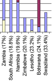
 By reorganizing data provided in the report, I was able to cast additional light on something that’s missing from the report. That being: It wouldn’t take a rocket scientist to make an argument that funding is highly political and falls short with regard to providing money for the countries that have the most need. The multi-colored columns are amounts of funding for individual countries and the connected dots plot adult HIV prevalence rates in those same countries from lowest to highest. Looking left to right, what’s telling is the first really tall column. Ethiopia has received the most donor funding (US$1.1B) and has an adult prevalence rate of 2.2%. Then if you look to the far right, the countries with highest prevalence rates have short columns. Zimbabwe has an adult prevalence rate of 20.1%, but has received only US$50M of funding. Of course, one has to factor in that the population of Ethiopia is about five times greater than the population of Zimbabwe. And several of the countries with tall columns are some of Africa’s most populous nations. But still. The columns on the far right don’t even come close to the line with the connected dots. And with its US$50M of funding Zimbabwe falls well short of the per country average total amount of funding (US$227M).
As much as I like my chart, it made me angry. Thick donor reports tend to garner a lot of fan fare, but ascertaining the most relevant information generally requires reading between the lines and reformulating the content of the report. I’m sick of the slanted donors (the politics and the system, not necessarily the individuals). For years, the world has noted the resilience, patience, and courage Zimbabweans exhibit given their ingenuity to adapt to difficult circumstances which have largely grown to be beyond the control of individual citizens. Jokes are made to help cope and people take solace that things could be worse. But with talk of more sanctions, things would become worse. I see no problem with bloggers being slanted. But for donors it’s inexcusable. Stop slanting, skewing, eschewing, politicking, etc. and instead, put sufficient amounts of money where it’s needed.
Download the JPEG, PDF or MS Excel version of this chart.
Note: If you download this chart, it will open in a MS Excel spreadsheet. When it opens, it will say: “The workbook you opened contains automatic links to information in another workbook. Do you want to update this workbook with changes made to the other workbook?” Click No to view the chart.


Tuesday, July 8th 2008 at 12:52 pm
That’s nearly a great chart, but it’d be a lot more useful if you addressed the issue you raise above by normalising funding for population.
There are 3 million HIV+ people in Zimbabwe (so funding of $17 per head), 300,000 HIV+ people in Swaziland (so funding of $200 per head), 2 million in Kenya (so funding of $500 per head), and 6 million in Nigeria (so funding of $150 per head).
Taking out country size as a factor not only makes the chart more relevant (we don’t care about countries – we care about people) but also brings the Zimbabwe example into even starker contrast…